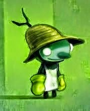
It's a crazy time at the moment, with so much going on (which is great!) but I really want to try and keep up with my personal work, especially messing around with digital illustration and concept work. I am keen to keep/ develop my style but really , REALLY need to up my game in terms of light, colour and design generally.
There is so much incredible stuff out there and I feel I have so much still to learn.
Anyway, this piece is called "Summer Hols" and as you can see the kid has let his imagination get the better of him while playing a game on his own!
Please feel free to critique my stuff.
Subscribe to:
Post Comments (Atom)


Nice man, love the composition and of course the style. If I were to critique I'd suggest maybe getting a touch of orange into the sky towards the top of the page and blending it down towards the yellow, I'm not 100% convinced it would improve things as the yellow definitely works, I'm just a fan of the old colour transitions.
ReplyDeleteCheers Dave,
ReplyDeleteGreat suggestion!
I think the orange fade really closes the image in and adds a mild suggestion of threat without being too cliched.....as much as you can with zombies anyway!!!